|
|
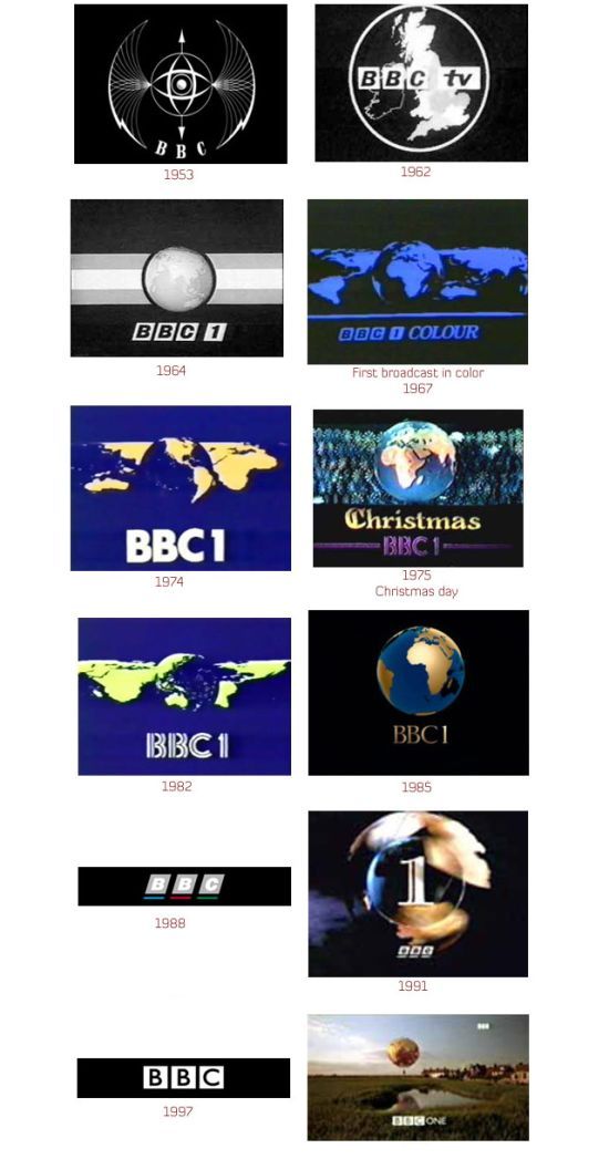
Logos Evolution
|
Logos today
The current era of logo design began in the 1950s. A paradigmatic contemporary logo is the Chase Bank logo, designed in 1960 by Chermayeff & Geismar, considered pioneers of Modernist graphic design in the United States. The Chase logo was “the first truly abstract logo” of the contemporary era. As would happen with many subsequent corporate logos, mass media advertising was used to link the logo with the bank in the public mind, while its simple, distinctive form, free of specific cultural or other connotations, was well suited to represent a complex, multinational corporation.
Today there are many corporations, products, brands, services, agencies and other entities using an ideogram (sign, icon) or an emblem (symbol) or a combination of sign and emblem as a logo. As a result, only a few of the thousands of ideograms people see are recognized without a name. It is sensible to use an ideogram as a logo, even with the name, if people will not duly identify it. Currently, the usage of both images (ideograms) and the company name (logotype) to emphasize the name instead of the supporting graphic portion and making it unique, by it non-formulaic construction via the desiginal use of its letters, colors and any additional graphic elements.
Ideograms (icons, signs, emblems) may be more effective than a written name (logotype), especially for logos being translated into many alphabets; for instance, a name in the Arabic language would be of little help in most European markets. An ideogram would keep the general proprietary nature of the product in both markets. In non-profit areas, the Red Cross (which goes by Red Crescent in Muslim countries) is an example of an extremely well known emblem which does not need an accompanying name. Branding aims to facilitate cross-language marketing. The Coca-Cola logo can be identified in any language because of the standard color and the well known "ribbon wave" design.
|
|


